Estimating cell cycle phases
In this vignette we will demonstrate how to identify cell cycle phases using single-cell RNA-Seq data
%load_ext autotime

import scarf
scarf.__version__
'0.16.3'
time: 989 ms (started: 2021-08-22 17:29:21 +00:00)
1) Fetch pre-analyzed data
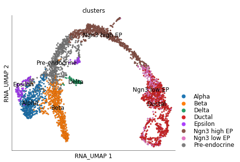
Here we use the data from Bastidas-Ponce et al., 2019 Development for E15.5 stage of differentiation of endocrine cells from a pool of endocrine progenitors-precursors.
We have stored this data on Scarf’s online repository for quick access. We processed the data to identify the highly variable genes (top 2000) and create a neighbourhood graph of cells. A UMAP embedding was calculated for the cells.
scarf.fetch_dataset(
    'bastidas-ponce_4K_pancreas-d15_rnaseq',
    save_path='./scarf_datasets',
    as_zarr=True,
)
INFO: Download finished! File saved here: /home/docs/checkouts/readthedocs.org/user_builds/scarf/checkouts/0.16.3/docs/source/vignettes/scarf_datasets/bastidas-ponce_4K_pancreas-d15_rnaseq/data.zarr.tar.gz
INFO: Extracting Zarr file for bastidas-ponce_4K_pancreas-d15_rnaseq
time: 12.6 s (started: 2021-08-22 17:29:22 +00:00)
ds = scarf.DataStore(f"scarf_datasets/bastidas-ponce_4K_pancreas-d15_rnaseq/data.zarr",
                     nthreads=4, default_assay='RNA')
time: 15.8 ms (started: 2021-08-22 17:29:35 +00:00)
ds.plot_layout(layout_key='RNA_UMAP', color_by='clusters')
time: 865 ms (started: 2021-08-22 17:29:35 +00:00)
2) Run cell cycle scoring
The cell cycle scoring function in Scarf is highly inspired by the equivalent function in Scanpy. The cell cycle phase of each individual cell is identified following steps below:
A list of S and G2M phase is provided to the function (Scarf already has a generic list of genes that works both for human and mouse data)
Average expression of all the genes (separately for S and G2M lists) in across
cell_keycells is calculatedThe log average expression is divided in
n_binsbinsA control set of genes is identified by sampling genes from same expression bins where phase’s genes are present.
The average expression of phase genes (Ep) and control genes (Ec) is calculated per cell.
A phase score is calculated as: Ep-Ec Cell cycle phase is assigned to each cell based on following rule set:
G1 phase: S score < -1 > G2M sore
S phase: S score > G2M score
G2M phase: G2M score > S score
ds.run_cell_cycle_scoring()
WARNING: 1 values were not found in the table column names
time: 1.48 s (started: 2021-08-22 17:29:35 +00:00)
3) Visualize cell cycle phases
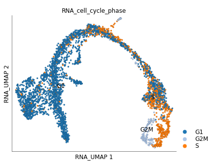
By default the cell cycle phase information in stored under cell attribute table under column/key RNA_cell_cycle_phase.
We can color the UMAP plot based on these values.
ds.plot_layout(
    layout_key='RNA_UMAP',
    color_by='RNA_cell_cycle_phase',
    cmap='tab20',
)
time: 266 ms (started: 2021-08-22 17:29:37 +00:00)
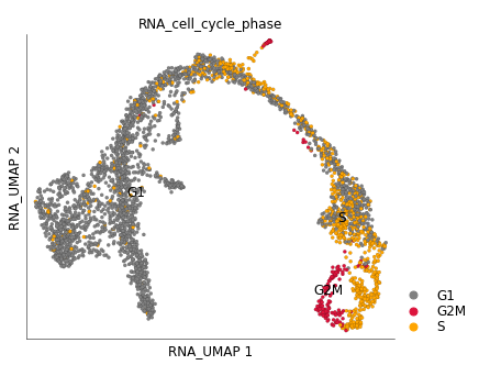
We can clearly see that cycling group of cells in the ‘ductal’ group. You can provide your own custom color mappings like below:
color_key = {
    'G1': 'grey',
    'S': 'orange',
    'G2M': 'crimson',
}
ds.plot_layout(
    layout_key='RNA_UMAP',
    color_by='RNA_cell_cycle_phase',
    color_key=color_key,
)
time: 266 ms (started: 2021-08-22 17:29:37 +00:00)
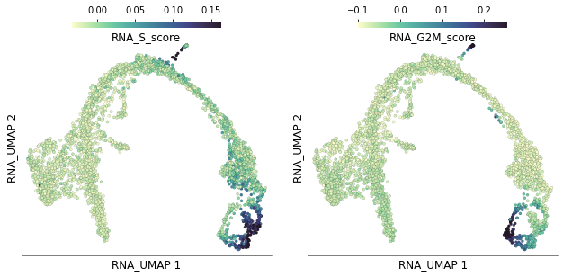
4) Visualize phase specific scores
The individual and S and G2M scores for each cell are stored under columns RNA_S_score and RNA_G2M_score. We can visualize the distribution of these scores on the UMAP plots
ds.plot_layout(
    layout_key='RNA_UMAP',
    color_by=['RNA_S_score', 'RNA_G2M_score'],
    width=4.5, height=4.5,
)
time: 1.04 s (started: 2021-08-22 17:29:37 +00:00)
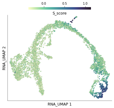
5) Compare with scores calculated using Scanpy
The dataset we downloaded, already had cell cycle scores calculated using Scanpy. For example, the S phase scores are stored under the column S_score. We can plot these scores on the UMAP.
ds.plot_layout(
    layout_key='RNA_UMAP',
    color_by='S_score',
)
time: 480 ms (started: 2021-08-22 17:29:39 +00:00)
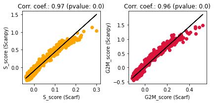
Unsurprisingly, these scores look very similar to those obtained through Scarf. Let’s quantify the concordance below
import matplotlib.pyplot as plt
from scipy.stats import linregress

fig, axis  = plt.subplots(1, 2, figsize=(6,3))
for n,i in enumerate(['S_score', 'G2M_score']):
    x = ds.cells.fetch(f"RNA_{i}")
    y = ds.cells.fetch(i)
    res = linregress(x, y)

    ax = axis[n]
    ax.scatter(x, y, color=color_key[i.split('_')[0]])
    ax.plot(x, res.intercept + res.slope*x, label='fitted line', c='k')
    ax.set_xlabel(f"{i} (Scarf)")
    ax.set_ylabel(f"{i} (Scanpy)")
    ax.set_title(f"Corr. coef.: {round(res.rvalue, 2)} (pvalue: {res.pvalue})")

plt.tight_layout()
plt.show()
time: 320 ms (started: 2021-08-22 17:29:39 +00:00)
High correlation coefficients indicate a large degree of concordance between the scores obtained using Scanpy and Scarf
That is all for this vignette.